Scale
Great logos work at both a small and large scale. From a thingy on a website URL bar to emblazoned across a billboard, a logo has to be clearly visible and retain its structural integrity.
Quality of line
Not a single pixel of a logo is accidental. Quality of line ensures visual harmony and creates the correct texture between the positive and negative spaces.
Communication
A logo must communicate who a company is, what they do and how they do it. That’s a lot for one image. Bring in a professional graphic designer and save yourself valuable time.
Colour
While a logo can be as many colours as you like, it’s important that it works in black and white, so it can be applied to window decals and receipts.
Readability
When using a typographic logo, ensure that it is easy to read by choosing an appropriate font and using even kerning.
Cultural fit
Context is appropriate. This is the fine balance of creating a logo which is unique and individual to your industry and geography. Different cultures have varying sense of taste. Ensure that the consumer you’re designing for will respond to your logo appropriately by researching thoughtfully first.
Print and digital
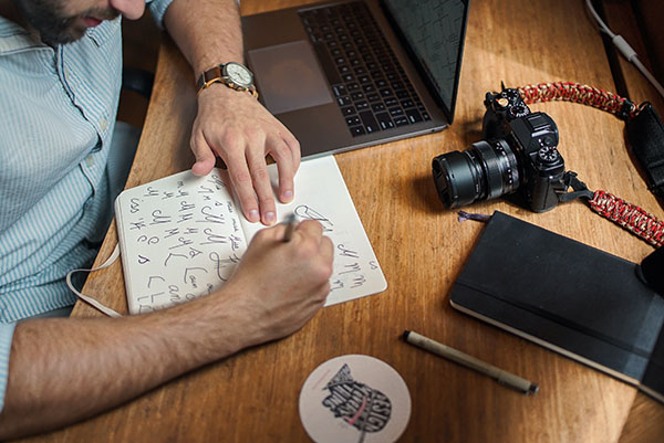
A logo needs to work on screen as well as in print more than ever. The way to do this is to design on paper, then render on screen, then print it out and compare the two. Does the colour print as expected? Is there any blurriness, pixellation or fine lines which get lost? Adjust, print and repeat until you achieve perfection. Don’t settle for ‘that will do’ – you’ll live to regret it.
Get smart
Logos which make it into design books are ones which are visually interesting. They are harmonious, communicate clearly and often include a visual trick, where two elements are happening at once. I did this for ethical coffee standard ACE and Rowland Hill Fund.
Brand consistency
Think of a brand as a family. Each individual element shares the same genetic code, while still retaining its unique role. My logo style for Royal Mail’s charity Rowland Hill Fund intentionally echoes the typographic style of the font Chevin, with clean lines and rounded corners. Both the type and the icon use the same colour palette too. If you find that part of your branding isn’t cohesive with the rest, don’t be scared to fix it.
It has to look beautiful
We all remember design which makes an impression on us. A logo which does all the above and looks elegant will drive profits for your company. This is why graphic designers are important for creating growth and you shouldn’t rely on your own artistic skills

