
Selecting a design studio for your company’s visual identity is sometimes not easy. Each has their own style. Identifying the degree of expertise is the key to gaining branding which will add value to your business.
It’s not cool to talk about logos. In 2019, Doritos intentionally ran an ad campaign without a logo at all. It’s all about brands these days. Your brand is what other people think about you. If I’m in the business of generating these thoughts, I intend to make them the best possible for my clients.
Logos are still a vital part of a brand, and frankly, I’m very good at designing them. Therefore, I’m writing about logos.
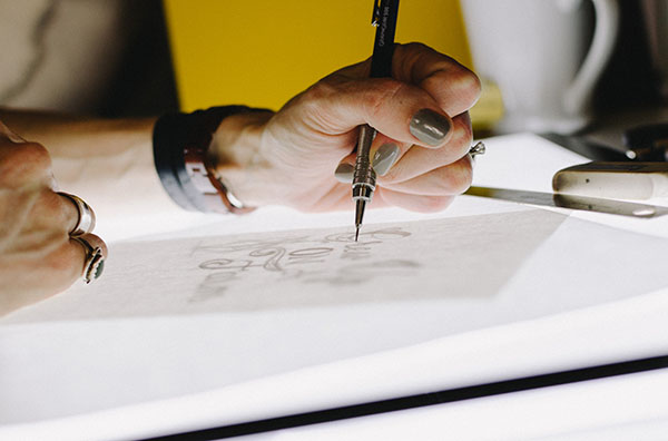
I have designed many logos across a variety of industries, and throughout I have adhered to an unbreakable golden rule. Following this ideal ensures my clients stand out from the crowd.
The rule is: a logo should always be recognisable in black and white.
Why?
Let’s travel back in time, to when your dad had a full head of hair. Black and white was the default for printing documents. Fax machines were the corporate buzz. Desktop print was in its primitive stages and the unreliable colour quality wasn’t worth the expenditure. Reproducing a logo consistently across communication, marketing, signage and screen can be a challenge even now. Throw in a dot matrix printer or a ‘90s website, and brand identity could become brand inconsistency. Having a logo which could be reduced to black and white didn’t cure these problems, but it could act as a sticking plaster.
But times have changed; technology has moved on: why should a logo still look great in black and white?
Firstly, there are still many possibilities for branding which require a single-colour logo — vinyl window adhesives, screen-printed items, books, eBooks, till receipts etc. Of course, not all businesses foresee purchasing these items, but it’s far better to be prepared for any eventuality, than to attempt a costly retrofit.
Next, imagine your printer runs low on cyan and prints your logo in a different colour. You’re in big trouble if it suddenly resembles another brand. If your logo can be reduced to greyscale and is still recognisable, you’ve struck gold. You own something unique which represents your business alone.
Finally, consider all the variables of a logo design. There’s shape, texture, colour and styling. The three latter aspects are often trend influenced. One year, watercolour logos are in, the next year it’s 2D minimalism. A great logo will survive years, not seasons. This is achieved by a pristinely rendered form.
Technical drawing skills are vital. Designers who understand quality of line, the power of negative space and the impact of scale are the ones who make memorable brands. Think of Nike, McDonalds and Apple. These are brands which work hard to generate profit for their companies. You can imagine these logos clearly because they are drawn perfectly. Even without any colours, they are iconic in black and white.
Now you know my secret, I'd love to discuss your brand with you. Email studio@abelldesign.co.uk.