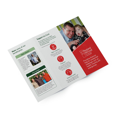
Brand Design for Rowland Hill Fund

Established in 1882, Rowland Hill Fund is Royal Mail's benevolent charity, helping Royal Mail workers and retirees through stressful situations.
Rowland Hill Fund are seeking to increase their brand awareness and to attract more donors. To achieve this, Abell Design gently updated the charity's branding.
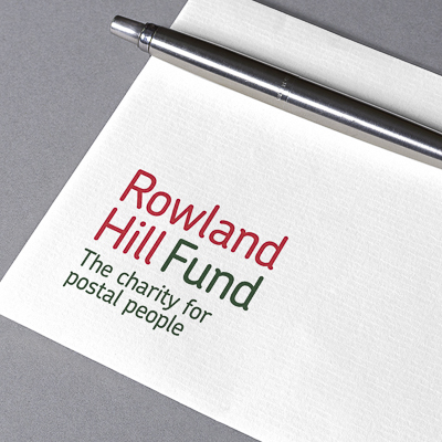
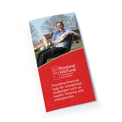
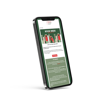
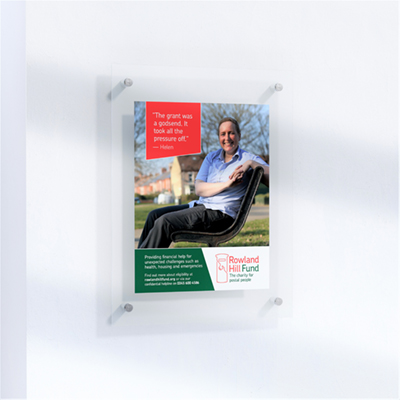
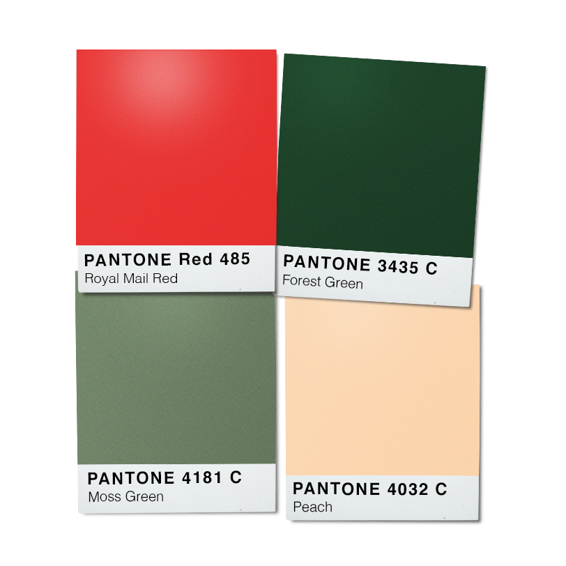
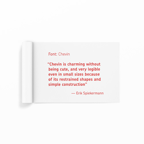
It was important that this was done sensitively, with consideration for the charity's history. While the charity operates independently of Royal Mail, a visual relationship between the two organisations had to be maintained. Therefore, Royal Mail's font Chevin was applied. A new colour palette, formed around the iconic Royal Mail red was introduced to provide a less clinical feel for the website.
Finally, an icon which represented Rowland Hill Fund was required. This needed to signify the charity's function, and using the legendary Royal Mail pillar box was a non-negotiable. Using only two lines, this icon tells a story and complements the rest of the brand elegantly.
"We commissioned Abell Design to refresh our brand. They listened to our needs and concerns with the uttermost care, and was highly responsive to our input. The finished work was creative, intelligent and beautiful. They made the process easy and pain-free. We would highly recommend Abell Design, and look forward to working together in the future."
Grace Owen, Fund Manager, Rowland Hill Fund