Brand for ACE 2030
How we created a brand inspired by values.
Fairly traded coffee growers Agri Evolve set the highest of ethical standards for their farmers and for the environment. Abell Design created an elegant logo which displays these values.
The creation of ACE (Agriculture, Community and Environment) was a framework to enable this. ACE required branding which would communicate both to farmers in rural Uganda and coffee roasters in the UK.
Designing for a Ugandan audience required different considerations to a British one. Any logos which are to be used in a rural setting must be easily hand painted on wooden signage. While English is spoken by some Ugandans, the word ace isn't a familiar term, so the emphasis had to be an acronym, rather than a word.
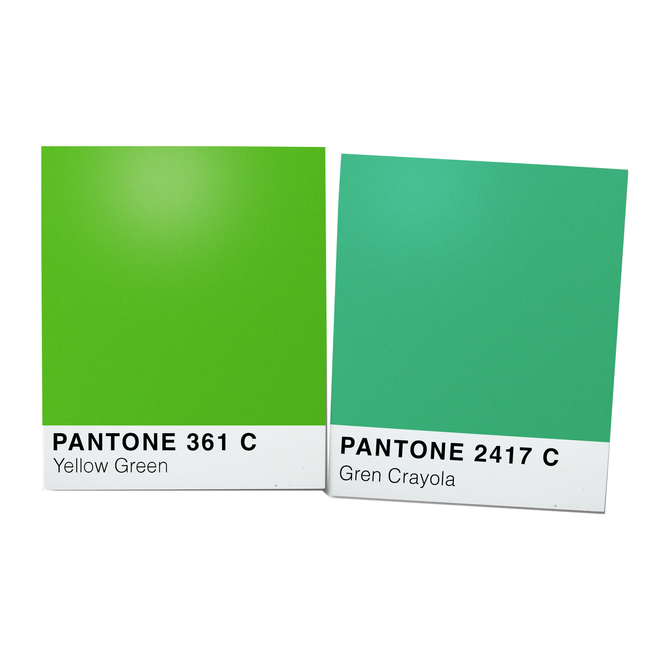
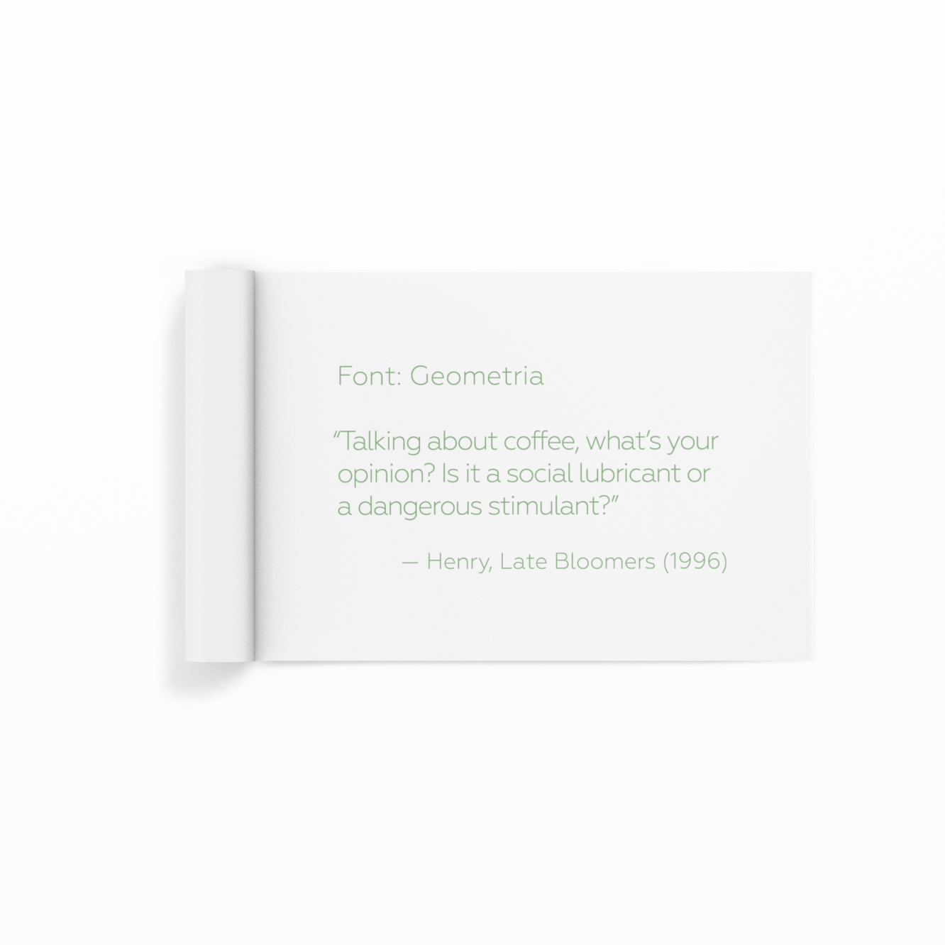
As ACE is connected with Agri Evolve, much of the brand design had to share some of Agri Evolve's visual traits, therefore the use of green and the typeface Geometria was retained.
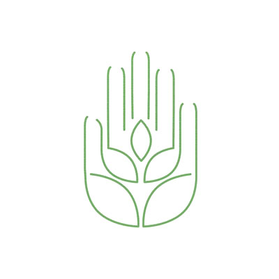
This logo design incorporates an ear of wheat (agriculture) with a hand (community). The environmental ethos is represented by use of the colour green.
This logo relies heavily on geometry, delicate use of line and negative space to create a beautiful logo which delivers a complex message instantly.
"We have used Abell Design for all of our branding over the past 5 years, and have always been delighted with the top quality work produced. They are an exceptionally talented and gifted designers and comes to each new job with enthusiasm, understanding and vision for the brief. They present with professionalism and clarity and has always worked closely with us to ensure the finished work is just perfect for our requirements. Great company, great talent!"
Martin Rowland, MD, Agri Evolve Ltd.